Like Rob, I recently got back from ICOTS. What a great conference. Kudos to everyone who worked hard to organize and pull it off. In one of the sessions I was at, Amelia McNamara (@AmeliaMN) gave a nice presentation about how they were using data and computer science in high schools as a part of the Mobilize Project. At one point in the presentation she had a slide that showed a screenshot of the dashboard used in one of their apps. It looked something like this.
During the Q&A, one of the critiques of the project was that they had displayed the data as a donut plot. “Pie charts (or any kin thereof) = bad” was the message. I don’t really want to fight about whether they are good, nor bad—the reality is probably in between. (Tufte, the most cited source to the ‘pie charts are bad’ rhetoric, never really said pie charts were bad, only that given the space they took up they were, perhaps less informative than other graphical choices.) Do people have trouble reading radians? Sure. Is the message in the data obscured because of this? Most of the time, no.
 Here, is the bar chart (often the better alternative to the pie chart that is offered) and the donut plot for the data shown in the Mobilize dashboard screenshot? The message is that most of the advertisements were from posters and billboards. If people are interested in the n’s, that can be easily remedied by including them explicitly on the plot—which neither the bar plot nor donut plot has currently. (The dashboard displays the actual numbers when you hover over the donut slice.)
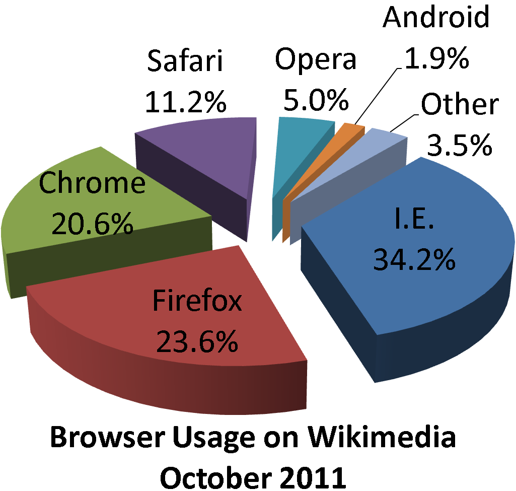
It seems we are wasting our breath constantly criticizing people for choosing pie charts. Whether we like it or not, the public has adopted pie charts. (As is pointed out in this blog post, Leland Wilkinson even devotes a whole chapter to pie charts in his Grammar of Graphics book.) Maybe people are reasonably good at pulling out the often-not-so-subtle differences that are generally shown in a pie chart. After all, it isn’t hard to understand (even when using a 3-D exploding pie chart) that the message in this pie chart is that the “big 3” browsers have a strong hold on the market.

The bigger issue to me is that these types of graphs are only reasonable choices when examining simple group differences—the marginals. Isn’t life, and data, more complex than that?Is the distribution of browser type the same for Mac and PC users? For males and females? For different age groups? These are the more interesting questions.
The dashboard addresses this through interactivity between the multiple donut charts. Clicking a slice in the first plot, shows the distribution of product types (the second plot) for those ads that fit the selected slice—the conditional distributions.
So it is my argument, that rather than referring to a graph choice as good or bad, we instead focus on the underlying question prompting the graph in the first place. Mobilize acknowledges that complexity by addressing the need for conditional distributions. Interactivity and computing make the choice of pie charts a reasonable choice to display this.
*If those didn’t persuade you, perhaps you will be swayed by the food argument. Donuts and pies are two of my favorite food groups. Although bars are nice too. For a more tasty version of the donut plot, perhaps somebody should come up with a cronut plot.
**The ggplot2 syntax for the bar and donut plot are provided below. The syntax for the donut plot were adapted from this blog post.
# Input the ad data
ad = data.frame(
	type = c("Poster", "Billboard", "Bus", "Digital"),
	n = c(529, 356, 59, 81)
	)

# Bar plot
library(ggplot2)
ggplot(data = ad, aes(x = type, y = n, fill = type)) +
     geom_bar(stat = "identity", show_guide = FALSE) +
     theme_bw()

# Add addition columns to data, needed for donut plot.
ad$fraction = ad$n / sum(ad$n)
ad$ymax = cumsum(ad$fraction)
ad$ymin = c(0, head(ad$ymax, n = -1))

# Donut plot
ggplot(data = ad, aes(fill = type, ymax = ymax, ymin = ymin, xmax = 4, xmin = 3)) +
     geom_rect(colour = "grey30", show_guide = FALSE) +
     coord_polar(theta = "y") +
     xlim(c(0, 4)) +
     theme_bw() +
     theme(panel.grid=element_blank()) +
     theme(axis.text=element_blank()) +
     theme(axis.ticks=element_blank()) +
     geom_text(aes(x = 3.5, y = ((ymin+ymax)/2), label = type)) +
     xlab("") +
     ylab("")


